I decided to quit doing these projects for many reasons.
1. Sam is not a good instructor.
2. He glosses over important stuff while lingering on obvious things.
3. When projects don't work the way he demos, we have no idea how to fix it.
4. There's never any explanation of why he does what he does. And I'm not sure of he does know.
100 Days of Swift
Sunday, January 8, 2017
Monday, December 26, 2016
Project 13: Circular Image
I just got done talking about how cool XCode and Apple is.
But now I will say how stupid hard it is to do such simple things like setting a border-radius of 50%

profileImageView.layer.frame.size.width / 2
That was too much when you could've just typed 50% or something.
Either this is really ridiculous of Apple or Sam just doesn't really know what he's doing.
Anyways, there's the finished project.

But now I will say how stupid hard it is to do such simple things like setting a border-radius of 50%

profileImageView.layer.frame.size.width / 2
That was too much when you could've just typed 50% or something.
Either this is really ridiculous of Apple or Sam just doesn't really know what he's doing.
Anyways, there's the finished project.

Project 12: Sticky Header Jumper
This project really showed me how cool developing Apple apps are.
The defaults that it comes with are just really amazing.
The headers are sticky by default. And there are a lot of really cool things you can do by just using a particular component.
This project also showed me how bad of a coder Sam actually is.
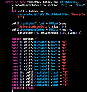
That super long switch statement could be reduced to this:

Other than the laughable code quality, the project was really fun to do.
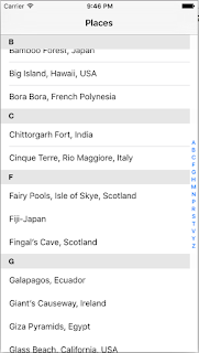
This UI looks really nice and high quality. It's hard to put out bad looking apps because XCode restricts what you can do (and for good reason).
The defaults that it comes with are just really amazing.
The headers are sticky by default. And there are a lot of really cool things you can do by just using a particular component.
This project also showed me how bad of a coder Sam actually is.

That super long switch statement could be reduced to this:
Other than the laughable code quality, the project was really fun to do.

This UI looks really nice and high quality. It's hard to put out bad looking apps because XCode restricts what you can do (and for good reason).
Project 11: Add Item
Project 10: Rearrange and Delete items
Project 9: Pull To Refresh
Man these projects are really a drag to get through.
We redid the UI from the previous project but this time we are to implement a "Pull to Refresh" functionality and replace the list with new items.

Sam honestly does a terrible job at explaining what he's doing when going through these projects.
"You do this, then do that, then do this"
Why Sam Why?
Can you explain better at why you're doing what you're doing?
We redid the UI from the previous project but this time we are to implement a "Pull to Refresh" functionality and replace the list with new items.

Sam honestly does a terrible job at explaining what he's doing when going through these projects.
"You do this, then do that, then do this"
Why Sam Why?
Can you explain better at why you're doing what you're doing?
Project 8: TableView
Subscribe to:
Comments (Atom)


